
The story behind APHA’s new look and feel.
By Christine Edgington with Rachel Florman
Dear Paint Horse lover,
APHA’s poised for big changes—the most notable being the headquarters’ potential move to the historic Fort Worth Stockyards, where millions of annual visitors will get to experience the beauty of Paint Horses that you enjoy every day. This step is a chance to tell a story—a true and great one that speaks from the heart of every Paint lover—and I’m glad to be along for the ride.
A brand’s story goes beyond words, and you’ve surely seen APHA’s bold, new look and feel. Gone is the timeworn horse-head logo and stuffy, official-looking acronyms of decades past. In their places are familiar colors, spotlighted key words and—can you believe it—not a horse head in sight.
It looks great, sure, but there’s a story behind it all, one that reflects the soul of the organization and, more importantly, the beautiful connections you share with your Paint Horses.
The Buffalo & the Paint Horse
I’ll admit, my job as senior brand strategist at One Fast Buffalo, a Dallas-based brand consulting agency, is a far cry from the dusty trenches of the equine industry, and though I’ve always loved horses, I’m not an owner myself.
But when my business partner, Ben, and I were approached with the task of carrying a horse association into a transformative new era, I knew it was a project with everything we seek: roots of Western American culture, an agile organization poised for growth and a team with a true passion for their work. I was completely intrigued.
Like the Paint Horse, One Fast Buffalo’s style is a little different. We don’t just make pretty slogans and logos, we tell a story. The world is simply too well informed to fall for just a pretty face; a design can be the most beautiful thing in the world, but if there’s no substance—no true alignment to the people you want to reach—it’s not going to create a lasting impact. Designs that speak from the heart go a little further.
So I got to work, immersing myself in APHA’s office culture, collecting anecdotes from passionate Paint owners, examining the industry landscape and sizing up the competition. To truly develop great ideas, I needed to learn everything I could about the soul and personality of APHA.
The result was 50 pages on everything Paint Horse. Then, the real work began. Great ideas happen when we’ve cut down stacks of notes to three bullet points on a white page; within razor-sharp parameters, infinite creativity blossoms.
It seems counter-intuitive, narrowing down to think big, but we’re no ordinary company, and the Paint is no ordinary horse.
When the dust settled, three points remained:
- Romanticism
- Performance
- An association that mirrors its membership
These three points helped shape and guide our design decisions, which help tell the story of unique horses marked for greatness.
Two Words
I imagine working for APHA is a little to horse lovers as roller coaster testing is to a thrill seeker—when you’re doing something you’re deeply passionate about, can you really call it a job? Instead of a faceless conglomerate, the Paint Horse association is filled with horse owners and ardent riders who are thoroughly connected to the equine world, both in and out of the office.
This passion is mirrored in the association’s membership: a community of people who fell in love with flashy horses and never looked back.
The organization, membership and all the programs contained therein are simply a means to an end. The association is there to help you have a better connection with your Paint, a better opportunity to explore horses or find a home within the horse community so you can better enjoy your lifestyle and everything that is included in loving Paint Horses.
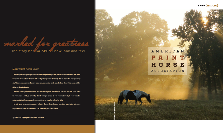
So I wanted to put the focus—in the office and out in the barns—where it truly is: squarely on the “Paint Horse.” For the unfamiliar, the new logo draws attention to the horse—not an ambiguous association. For the devoted, it’s a rededication to what’s most important.
Familiar Colors
Think “Paint Horse” and a patterned horse standing in front of a plain background isn’t what comes to mind. No, your imagination runs wild, illustrating majestic steeds loping across open prairies or a newborn foal resting in a bed of grass.
You can find these vivid, natural colors that surround Paints in our color palate, too. While primary iterations of the brand feature chocolate and chestnut tones pulled straight from coat colors, others feature the greens of the prairies and reds of the Wild West across which Paints once roamed.
Pair these colors with an emphasis on Paints, and you’ll be dreaming of riding anytime your membership comes to mind.
Brand Mark
While colors and logos are neophyte-friendly, leaving nothing to the imagination about who or what APHA stands for, that funny little “PH” brand mark is just for you, dear members. Like a secret symbol meant only for those in the know, the brand mark simultaneously fits into the Western world and stands out, unique among the industry’s white noise of logoed horse heads, silhouettes and horseshoes.
It’s a little abstract—some might see a horse, a branding iron or something else entirely—but it’s unquestionably Western. It’s something to wear and share with pride, without looking like the association’s billboard. Plus, you’ll look chic during your post-barn grocery run, even as bits of hay trail you down the produce aisle to pick up more carrots for that special someone.
A Story of Greatness
The real storytelling lives in our tagline, “Marked for Greatness.”
##
This excerpt is from the Winter 2016 issue of Chrome—read the entire article here: